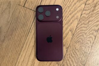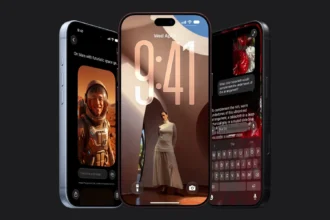


The transition from rigid slab smartphones to flexible form factors repeatedly highlights a structural friction point in consumer electronics: software platforms designed for single static displays struggle to feel native when translated to dual-screen hardware. While hardware engineers have made massive strides in hinge durability and display glass flexibility, software user interfaces frequently default to basic split-screen layouts or scaled-up mobile apps. An examination of early builds reveals how the experimental iOS 27 foldable interface attempts to resolve this disconnect by breaking away from standard conventions. Installed on prototype hardware designated as the iPhone Duo, this operating system variant explores whether spatial interaction paradigms must be reinvented when screen geometries shift.
For over fifteen years, the primary anchoring element of iOS has been the horizontal bottom dock, a persistent container housing critical applications regardless of home screen navigation. In standard configurations, this horizontal dock relies on natural thumb accessibility near the bottom edge of a portrait display. However, when a device unfolds to expose an expanded aspect ratio, holding the hardware with two hands or balancing a wider chassis shifts optimal ergonomic zones from the bottom edge to the side borders.
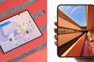
This spatial reorientation alters the foundational geometry of the home screen grid, forcing app icons, widgets, and system controls to realign around a vertical axis. By shifting essential application targets to the right perimeter, the software prioritizes single-handed thumb accessibility while the device is held open, minimizing physical reach required to launch core tasks. This structural change highlights a broader trend in foldable iPhone hardware analysis, where layout geometry is bound to physical ergonomics rather than historical software conventions.
Ergonomics of the iOS 27 Foldable Interface
Relocating the dock to a vertical layout along the right-hand side represents a fundamental shift in interface design. Placing controls along the vertical margin creates direct physical alignment with natural hand positions during extended dual-screen use.
Re-engineering Touch Mechanics for Asymmetric Displays
Repositioning the primary dock vertically creates ripple effects across the entire interface layout, forcing key status indicators and contextual menus to adapt to new spatial boundaries. In a standard mobile layout, the top status bar spans the horizontal width of the display, serving as a dedicated region for time, battery percentage, cellular reception, and wireless connectivity status. On the prototype running the iOS 27 foldable interface, this traditional top bar is dismantled entirely. Instead, system status elements collapse into a single, compact circular icon positioned in the upper right corner of the display.
Collapsing multi-icon status clusters into an aggregated circular indicator frees up valuable vertical display height, allowing expanded application viewports and uninhibited content presentation. Tapping or interacting with this condensed indicator expands detailed system metrics on demand, shifting status monitoring from a permanently visible infrastructure element to a contextual overlay. This reduction in UI overhead demonstrates how software environments must prune persistent visual noise to accommodate the expanded screen areas of dual-display or folding architectures.
Equally notable is the repositioning of the Dynamic Island. Originally introduced as a localized hardware-software bridge around a camera cutout at the top center of standard iPhone screens, the feature is rotated vertically and integrated directly alongside the right-side vertical dock layout. By consolidating contextual alerts, live activity trackers, and media control widgets into the same vertical axis as app shortcuts, the software concentrates all primary system interaction points along a single edge.
This consolidation transforms the right margin of the display into an active command column, allowing users to monitor background activities, switch applications, and review notifications without sweeping their fingers across the entire display surface. However, this asymmetric focus on the right-hand side introduces immediate ergonomic trade-offs. While right-handed users gain direct thumb access to every high-frequency control, left-handed operation becomes inherently more cumbersome unless the software provides dynamic orientation flips or custom layout toggles based on grip detection.
Visual Continuity and Render Pipeline Demands
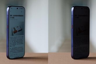
Beyond physical layout adjustments, software responsiveness during hinge movement remains a defining benchmark for foldable user experiences. When opening or closing flexible hardware, display drivers and window management layers must rapidly recalculate aspect ratios, resize active viewports, and redraw UI elements without frame drops or visual tearing. The iOS 27 foldable interface incorporates a specialized dynamic blur effect that activates fluidly during screen opening movements, creating an elevated sense of optical depth and continuity as the canvas expands.

This dynamic blur is not merely cosmetic; it serves a crucial functional role in obscuring short frame-rendering delays and layout recalculations while application windows expand to fit the unfolded canvas. By applying a real-time, hardware-accelerated depth blur across background elements during physical panel movement, the interface conceals mechanical transformation behind an organic visual transition. This approach reflects principles detailed in official Apple developer documentation regarding spatial blur filters and high-frame-rate compositor pipelines.
Achieving this level of visual fluidity requires tight synchronization between display refresh rates, hinge state sensors, and the graphics processing subsystem. Traditional mobile operating systems often suffer from awkward layout jumps or temporary application redraw glitches when transitioning between closed and open states. By using variable GPU blur shaders that react directly to physical hinge angle inputs, the system creates a seamless visual bridge between folded and unfolded states, establishing an elevated standard for software polish on novel hardware configurations.
Performance Constraints and Memory Overhead
Maintaining high-resolution spatial blurs and instant layout recalibrations across dual displays imposes significant real-time burdens on system memory bandwidth and graphics processing cores. Running multiple active viewports alongside a vertical utility column requires memory controllers to dedicate persistent frame buffers specifically to background state caching. If background applications are forced to pause or dump frame states during unfolding maneuvers, the illusion of fluid transition collapses immediately.
Furthermore, managing touch sampling rates across flexible panel materials presents unique low-level engineering challenges. Flexible polymer displays exhibit different physical capacitance properties than rigid cover glass, requiring adaptive touch controller drivers to filter out accidental palm touches along the right edge where the vertical dock and Dynamic Island reside. Balancing extreme touch sensitivity for precise dock navigation with aggressive palm rejection algorithms along screen folds represents a complex technical trade-off, similar to challenges seen when omitting stylus support on flexible displays to protect panel longevity.
Comparative Multitasking and System Paradigms
When evaluated against competing software paradigms in the mobile landscape, the architectural choices seen in this prototype highlight distinct philosophy differences regarding foldable multitasking. Existing platforms commonly attempt to mirror desktop environments by introducing floating application windows, complex multi-pane taskbars along the bottom screen edge, or freeform window resizing. While functional, desktop-style multitasking on mobile devices frequently increases cognitive load and leads to crowded touch targets on screen sizes ranging from seven to nine inches.
In contrast, the iOS 27 foldable interface prioritizes streamlined vertical navigation over freeform window clutter. By combining app launching, live activity monitoring, and system status indicators into a unified perimeter rail, the layout reserves the central display area purely for application content. This design strategy seeks to maintain the focused simplicity of mobile software while offering the display expansion of a tablet format. Maintaining strict layout guardrails ultimately yields higher application performance and superior user retention compared to open-ended windowing engines.
However, this structured layout presents distinct challenges for legacy software compatibility. Millions of existing iOS applications are compiled for standardized vertical aspect ratios with assumptions about fixed status bar locations and bottom-anchored navigation bars. When executed within an asymmetric vertical rail environment, legacy apps must either run inside letterboxed virtual containers or adapt dynamically via developer updates. Forcing third-party developers to refactor user interfaces for non-standard dock alignments risks fragmenting the application ecosystem if adoption rates across foldable hardware remain localized to high-end market segments.
The architectural divergence seen in this interface illustrates that the future of foldable mobile computing depends as heavily on software innovation as on hinge physics. By replacing desktop-mimicry with dedicated perimeter control structures, operating systems can maximize screen utility without sacrificing thumb accessibility. As flexible display components mature and software frameworks adapt to non-standard form factors, the integration of physical hardware geometry and responsive software interface layers will define the next decade of mobile user experiences.